Year
2024
Duration
3 week sprint

Client
NCLEX High Yield
Role
UX/UI Designer
UX Researcher
Tools
Figma
Figjam
Team
Gabriel Geissler
Courtney Estes
Laura Tornos
NCLEX High Yield
Making Study Materials More Accessible for Nursing Students
NCLEX High Yield’s program fosters a sense of community for students as well as providing them with proven methods to prepare them for their journeys into healthcare. The program offers a platform for student for prepare for their NCLEX nursing exam, a necessary certification in becoming a practicing nurse.
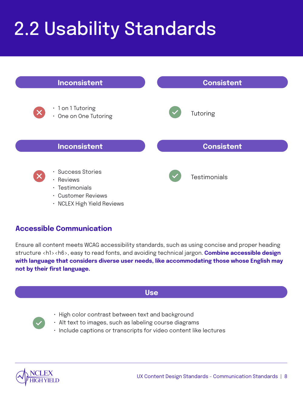
Usability Issues:
01/ Logging In:
03/ Product Clarity:
05/ The Two Sites:
06/ Poor Information Architecture
“The ASK Graph and Method are pinned all over their instagram but not really on the site”
“What’s the purpose of the second website? That part’s confusing”
04/ Lack of Visual Hierarchy:
“I wouldn’t purchase the services because I never saw what they were”
02/ Terminology:
“I had to keep searching for the login page for the on demand course”
“People who are not born here or English is their second language, it might be difficult to navigate for them”
“This doesn’t seem to be any different than the prior webpages”
{Research}
Speaking Directly With Users
Understanding the Market
We coordinated a set of 6 user interviews, 5 usability tests, and 8 survey responses to grasp the pain points that NHY students were facing. The interviews and tests were conducted over Zoom and Google Meet, with the survey being filled out virtually. Demographic insights included that the majority of users identified predominantly as female, with 62.5% having learned English as a second language and for the most part interacted with the site on a daily basis.
We took a deeper look into the world of online nursing prep courses. Key insights from our competitive analysis included an understanding of industry standards such as the usage of On Demand across platforms to self paced courses and preference for reviews to be called testimonials. Most sites ranked low on accessibility by WCAG standards. All sites highlighted a specific and often catchy methodology. Competitor brands in our analysis: Kaplan, Hurst Review, ATI, and Remar.
We also noticed that as opposed to its competitors, NHY offered a more personable approach. This helped us with branding and setting tone of voice, since we wanted to improve the site while not losing its unique connection to users.
but
75% expressed appreciation for the program
so.......
“The NCLEX is overwhelming so the site should be straightforward and not overwhelming”
Make student’s lives easier
Foster a learning environment
Make the site pleasant to use
✅
👩🏽🎓
📚
👍🏼
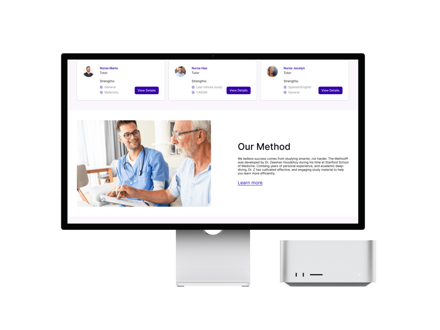
Problem 01: Logging In
Problem:
The old site did not display a prominent, actionable, login button on their home page. This was a noticeable pain point that many users brought up as they would describe difficulty accessing course material because of the initial visibility of the button. In order to locate the login, a student would need to open the On Demand course tab and be redirected to the second site to find it there. This proved to be unintuitive to the users who were who expected it at on the first page they see or possibly on their profile page.
Solution:
We created the solution by employing internet best practices so we fed into what average users as well as our sample group would expect the login to be. With the addition of the login button at the top right of the nav bar, being visible on a user’s first visit as well as being actionable throughout all pages, the login was an integral feature that we brought to the forefront.
Before
After
nclexhighyield.com

No Visibility On First Visit
Buried Location
Requires Trial And Error
nclexhighyield.com

Actionable Login
Higher Visibility
Consistent Across Pages
Problem 02: Terminology
Problem:
Our discovery that there were certain terms that were industry standard for the NCLEX exam prep sphere came as a surprise to us. Terms like On Demand to describe self paced course material were consistent with all competitors, however with consideration that NCLEX High Yield had a higher number of students did not speak English as a first language caused us to consider how improve comprehension for the average NHY user, unloading the stress from site navigation.
Solution:
By conducting an accessibility evaluation and consulting universal internet guidelines for linguistics, we chose to change certain terms so that the website would be more comprehensible to a wider audience. In our creation of the UX Content Guidelines design system we outlined elements such as tone and voice as well as communication standards that the brand employ. In this we emphasized a relatable and supportive tone to stick with the positive perception that the NHY had among its users. Boosting clarity and keeping language consistent were key features of this section of the design system. Furthermore, keeping text compliant with WCAG guidelines was stressed addressed by: ensuring high color contrast between text and background, labelling course diagrams, and the inclusion of transcripts for video content.
Simpler Terms
Concise Explanations
Easier For Non-native English Speakers

Design System Reference:

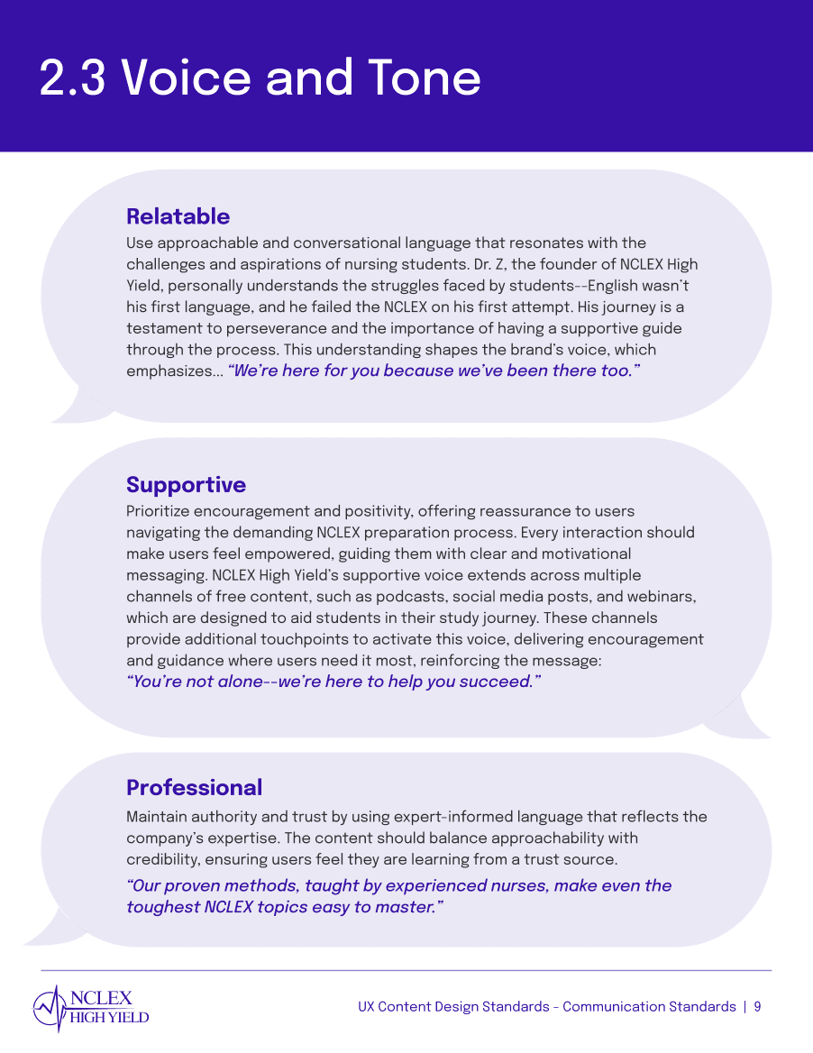
“Cardio is going to the damn gym. Its cardiology. So linguistically its not appropriate”
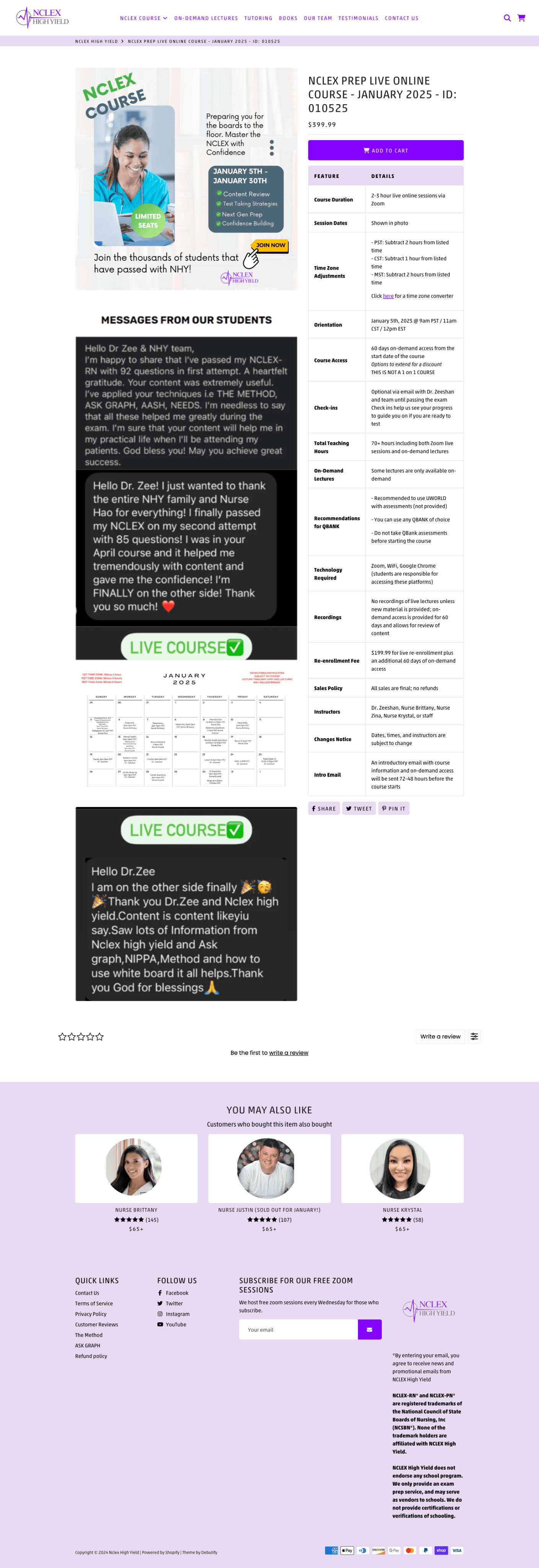
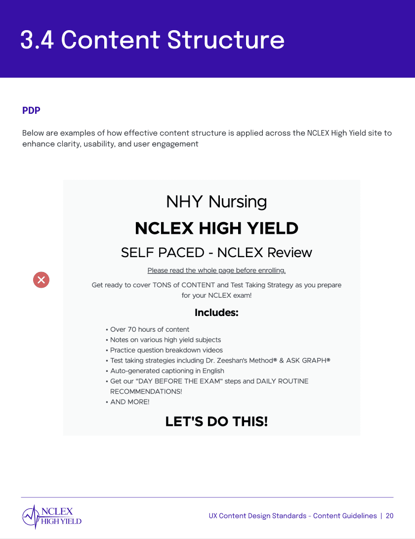
Problem 03: Product Clarity
Problem:
As we tackled terminology and branding, we found that many users (especially new users who hardly had any experience with the website) explained that they couldn’t grasp exactly what the course offered. This was a pain point shared even by frequent users who showered the staff with praise. They stated that people who were just viewing the website with no prior information might find the course offerings hard to decipher.
Solution:
This problem we interpreted as a branding issue. In order to much of the services were hidden upon an initial visit to the site. Getting straight to the point with the header bar immediately displaying all courses and being visible from the get go was extremely important. We created course PDPs that were available on first visit of the site as well as conclusive About page to give more detailed information. The benefits and offerings of the program were made immediately accessible. Emphasizing short and concise phrases and clear language increased interpretation of course material.
Before
After
nclexhighyield.com
Unclear Product Descriptions
Lack of Differentiation Between Paid and free Features
No Highlighted Services
nclexhighyield.com

Services Visible on First Visit
Easily Digestible Impact Scores
Consistent Branding
Design System Reference:

“NCLEX High Yield gives you a full understanding of everything – they really teach you how to be a better nurse”
Problem 04: Lack of Visual Hierarchy
Problem:
Along with Problem 03: Product Clarity, the site did not display many features that drew the eye. Both the color scheme as well as the text fields and imagery did not meet visual design best practices. With neither pops of color to convey important features or textual hierarchy, users in our usability tests would roam around the site until they discovered what they were looking for. There were cases where participants who had described themselves as frequent users, who attempted to click on a button only to find out that it was an JPEG image.
Solution:
Establishing a solid system of visual hierarchy was crucial is creating viable information architecture. We adjusted text, image, and other visual element referring to formatting standards by leading companies to create an intuitive digital environment. We stressed highlighting important information both for function as well as aesthetics. This led to an increase in user satisfaction exploring the site as well as improved understanding of what each page offered.
Highly Visible Purchase Items
Color Swatches Signal Interactivity
Easier For Non-native English Speakers
Design System Reference:


Problem 05: The Two Sites
Problem:
Referring to our heuristic evaluation and usability tests, we found that many users got confused after proceeding to another webpage. NHY’s implementation theme hosted by Shopify with a site hosted by Teachable caused both UI themes to be inconsistent when moving from home page to course material. Many user’s expressed frustration with this aspect of the site and went on to state that the shift between the two was jarring.
Solution:
To prevent a digital doorway effect, we ensured that our UI was consistent stylistically with the Shopify CMS while elevating the NCLEX High Yield brand image. We designed page modules that allowed for a seamless transition between the two sites and that were applicable to a variety of use cases. Drawing from our design system, we established consistency standards across all sites and communicated our decisions effectively for later teams who might take over the project. Furthermore, the integration of visual markers such as the segmented control on the About and Events and Resources pages, gave users more assurance in where they were located in a certain flow.
Before
After
nclexhighyield.com
Nav Bar Changes Between Sites
Disorienting Design
Lack of Similarity
nclexhighyield.com
Consistent With Shopify CMS
Consistent Nav Bar
Intuitive Navigation Back and Forth
Design System Reference:

Problem 06: Poor Information Architecture
Problem:
After our full site audit and SWOT analysis, information architecture was a prominent problem in users’ navigation through the website. Along with Problem 04: Lack of Visual Hierarchy, there was no indication of feature importance across the whole site. This led to confusion in users brought out by information being buried within pages. Difficulty in finding course material of in the case of Problem 01: Logging In, were symptomatic of the overall inconsistent navigation bar and lack of page titles, headers, and heroes.
Solution:
A SWOT Analysis and feature prioritization allowed us to synthesize what the program brought to the table and how we were going to bring it out in our sitemap and final design. In choosing what pages would be on the navigation bar, we drew from popular opinions from users such as their affiliation to the Testimonial section stating that it improve brand loyalty and their trust in the program. Having all the Courses in one dropdown was important to distinguish between what was is a paid course and what is a free resource.
Courses All In One Place
Established Content Prioritization
Easily Accessible
Design System Reference:


“The content is what is important and everything there is valuable”
– thankful nursing student
– frustrated nursing student
– practicing nurse
– grateful nursing student
{Takeaways}
Feedback
Learnings
Growth
After final deliverables were presented, the NCLEX High Yield team said that they loved the everything that we had done to improve their site and that they were excited in taking the next steps in implementing our redesign. We got the feeling that they couldn’t wait to integrate what we had made!
We were fortunate that NCLEX High Yield gave us full reign over the process and were incredibly communicative and compliant with any resources we needed. A key area of growth was in actualizing a redesign with the integration of third party platforms such as Shopify and Teachable. In working around the restrictions within those CMSs, I was able to become more knowledgable about how they are integrated into a site as well as how to work around them so that navigation between the two doesn’t get confusing for the user.
Over this whole process, I grew a lot as a UX designer and researcher. Our design team was amazing and the NCLEX High Yield staff were more than grateful for our work. I believe that we ended up improving the lives of many nursing students.
Finding the Why
Heuristic Analysis
We based our heuristic analysis of the model proposed by the Nielson & Norman group, allowing us to quantitatively back up the qualitative data that we got from users. Across the board, the NHY site did not meet best practices however in areas such as communication and learnability, ratings were especially poor. Many students recalled an experience where they had to email the staff solely for usability issues. Direct communication between staff and students were fairly routine, but student would say that since they appreciated the program, they would “put up with it”.
View Heuristic Analysis
Addressing the IA in the Room
In our competitive analysis, we created a comprehensive site map for each brand. By doing this we were able to get a more holistic view of information architecture across all brands. Moreover, this gave us a visualization of why users were getting lost and made one pain point even more obvious: the site was not one site, but two.
The Two Site Problem
One glaring issue that was raised in all user interviews was that in order to purchase content on the site, clicking on certain pages would bring you to a secondary site that integrated a Shopify plugin. Some pages on the home page site (nclexhighyield.com) header bar would send the user to the course page site (nclexhighyieldcourse.com). Further confusion was because the course/checkout site included remade header bars and pages, in some ways seeming like a doppelgänger of the initial home site. The two site model was leading source of user frustration, only intensifying other pain points.
{Synethesis}
Connection Via Creation
Powered by the insights we received from research, we turned our attention toward the synthesis process where we created a user persona to reflect the perspective of the average NHY user. This was key in allowing us to keep the user in mind throughout the design process. Emily (the name we gave her) reflected the values and habits of the nursing students, based on conversations with real users.
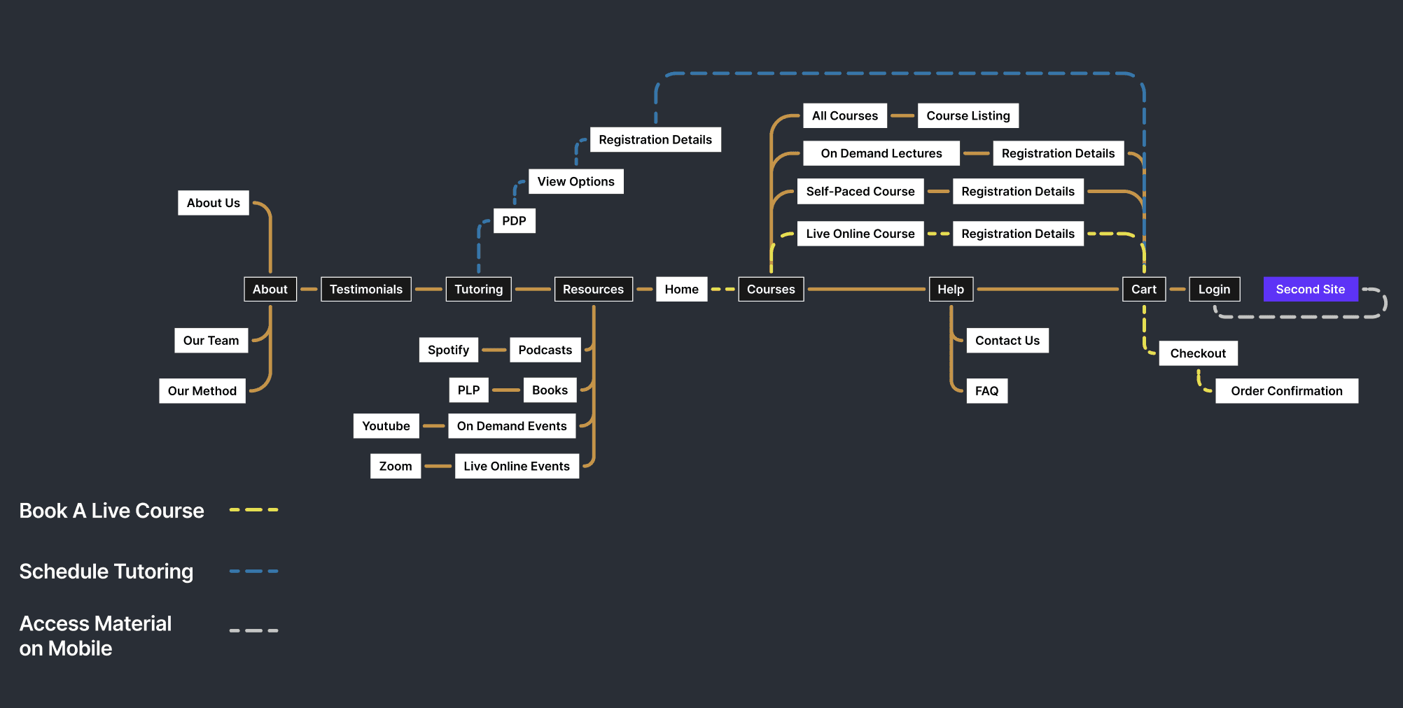
User Flows and Sitemapping
In order to address issues with navigation, we utilized our user persona in a series of user flows which outlined how she would interact with the website. We created the flows in that succession that she progressing into becoming more accustomed with the site: the first being her discovery of the program and signing up for a Live Online Course, the second is when she getting used to the site but explores other options such as Tutoring portal, and the third being when she is fully accustomed to the site and accesses course study material on mobile. Throughout each step in ideation, we strived to have a holistic perspective to inform us on as many needs a user might have.
The sitemap we created was the basis for when we went on to wireframing. Navigation was a prominent pain point for many users, so simplifying and designing an intuitive model was crucial in solving usability issues. Since we wanted to make our design as viable as possible for NCLEX High Yield, we chose to treat the second site as strictly a course material site and a login portal instead of a copy of the home page website which was there before. Our goal was to streamline the current model as much as possible. Integrating similar stylistics and keeping the header bar the same across both sites were a allowed for a less jarring user experience.
View Full Sitemap
View User Flows
Annotated Site Map:

View Full User Persona
The Path to Solution
Emily: The Average User
Initial Sketches
We proceeded into the beginning stages of the design process with rough sketches detailing rough layouts as well as outlining a plan of execution. Our mission was on our minds: to improve navigation on the website, making it more intuitive to use for the students as well as highlighting what the program offers. In order to present them with both a viable product as well as next step in integrating our design, we outlined the following final deliverables:
A High Fidelity Prototype
A Comprehensive Design System
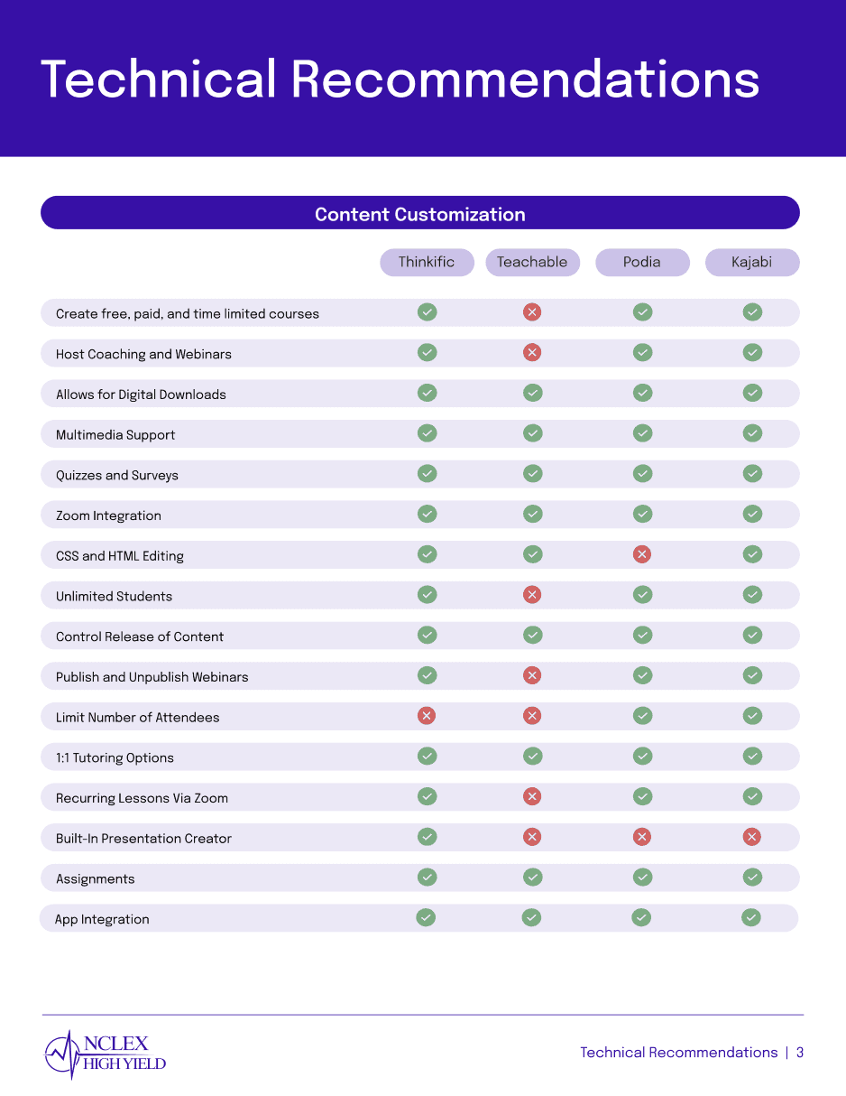
An Outline of Best Practices and Technical Reccomendations
Our User Persona, Emily was the culmination of all the data that we gathered in the research process. We made her be a 33 year old nursing student based in Boston, Massachusetts. We created her based on common patterns that we observed in most NHY users including an the preference for short burst study periods, accessing Live Online Course portal on laptop while accessing podcasts or other free resources on mobile. In her creation, she also helped us visualize the frustrations such as poor navigation and goals such as the motivation to pass her NCLEX exam on the second attempt.

Emily
NCLEX High Yield Student
Gender:
Age:
Location:
Job:
Female
33
Boston
Nursing Student
DEMOGRAPHICS
Patterns:
Environment:
Tech Tools:
Pain Points:
Studies in short, structured sessions, often early mornings or late nights, using visual/auditory materials
Studies at home in her apartment’s kitchen, and uses noise-cancelling headphone to block out distractions
Uses her laptop to follow Live Courses, and Mobile to find resources to listen to during the day (Podcasts)
Struggles with retaining large volumes of information, and navigating complex terminology
STUDYING BEHAVIOR
{Design}
Embarking into Wires
UX Content Standards
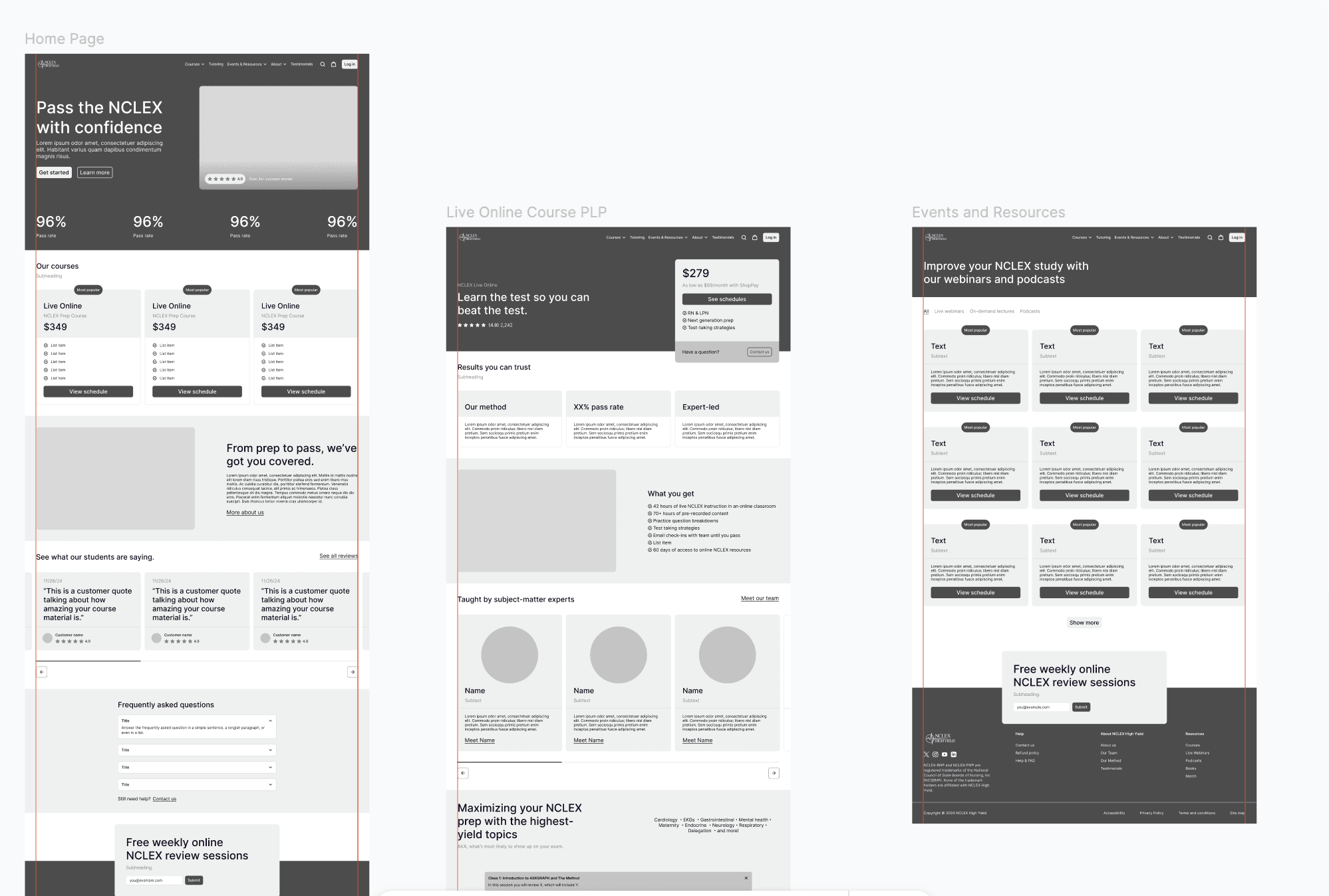
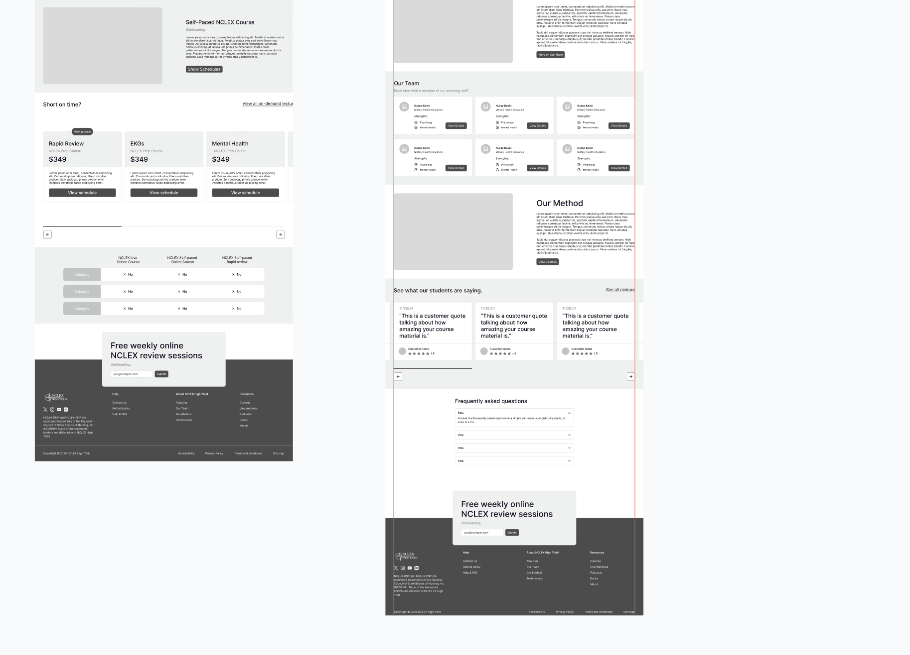
We began the design stretch of the project with excitement and the hope that we could build a better learning environment for the students that we talked to. We organized our materials in a Figma file and got to work. Drawing from all the data that we had picked up along the way, we were ready and fully informed on the impact this could have.
While were deep into the wires, we also began our creation of the UX Content Standards design system, outlining necessary information in regards to any future manipulation of our final design as well as next steps on how NCLEX High Yield could proceed with the final deliverable. In it we document important areas such as communication standards, usability standards and accessibility along with a component library and technical recommendations for automation in place of the Shopify to Teachable plugin that they were using before.
Home
Live Course
Events & Resources
All Course
About
View Prototype
View Design System
View Figma File
About NCLEX High Yield
NCLEX High Yield emphasizes fostering personal connection with their students in the space of online nursing prep. They offer a unique blend of personable education resources with study methods that have many of their users swear by.
The Discovery
The Challenge
Despite NCLEX High Yield’s ability to connect with their students, many reported that the site was difficult to use and that crucial features such as course material were often buried in pages. Through surveys, user interviews, and usability testing, we got to know the users and were able to mark down pain points.
Redesign NCLEX High Yield site to improve navigation and enhance study material to improve the lives of nursing students, providing NHY with a comprehensive design system outlining standards and next steps.


Let’s Make Something Beautiful.

